Brand Guidelines
Find assets and review how to use the VeriClock brand in your communications.
Find assets and review how to use the VeriClock brand in your communications.


Full-Colour Horizontal Logo
Use this version of the logo when it is laid out horizontally against white or very light backgrounds.
Monochrome White Horizontal Logo
Use this version of the logo when it is laid out horizontally against darker backgrounds.


Full-Colour Icon
Use this version of the logo when only an icon is required, against white or very light backgrounds.
Monochrome White Icon
Use this version of the logo when only an icon is required, against darker backgrounds.
Logo Clearspace
Whenever you use the logo, it should be surrounded with clear space to ensure its visibility and impact. No graphic elements of any kind should invade this zone. To work out the clearspace take the height of the logo and divide it in half
(Clearspace = Height/2).
Minimum Size
Minimum logo size is 0.25 inch in height. Please do not use a logo smaller than this to ensure that it will be printable without losing design quality.
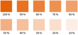
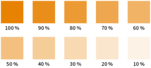
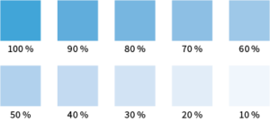
In situations where solid colours are required, such as in print materials or smaller website elements such as text, the solid colour palette should be used. To maintain the integrity of the VeriClock brand, never use colours that are not part of the defined colour palette.
#D86018
#D57800
#4698CB
#75787B
Primary
CMYK: C0 M71 Y100 K3
Pantone: 1595 C
RGB: R216 G96 B24
Web: #D86018
Secondary
CMYK: C2 M56 Y100 K3
Pantone: 1385 C
RGB: R213 G120 B0
Web: #D57800
Secondary
CMYK: C69 M19 Y4 K0
Pantone: 7688 C
RGB: R70 G152 B203
Web: #4698CB
Tertiary
CMYK: C30 M22 Y17 K57
Pantone: Cool Gray 9 C
RGB: R117 G120 B123
Web: #75787B

Only the following four gradients are acceptable for use in VeriClock’s brand.
Never combine gradients or make up new ones (ie. orange to blue).